The chalkstripe DB is a classic for any man's wardrobe...unfussy, it exudes a classic feel and style and is suitable for daytime wear for business and formal enough to carry one through an evening of cocktails and dinner.
I will start a series of articles to delve deeper into what makes a suit work or not...and we begin with a good friend - Wei Koh, Founder and Editor in Chief at Revolution Press...the publishers of watch magazine Revolution, menswear magazine The Rake and ladies luxury magazine Cake.
Wei is a natty and rakish (no pun intended) dresser, with a touch of wild modernism to traditional English styling.
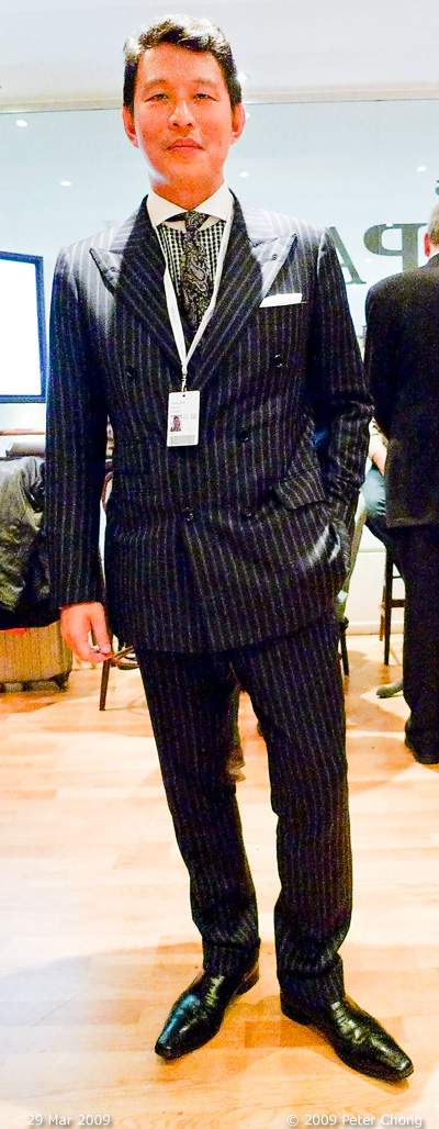
The suit is made by Eddy Chow of Hong Kong. Fabric is Loro Piana Super 120 double pinstripe that from a far looks like a single chalk stripe. Shoes are from Gerard Sene.
My personal view of the suit:
- lovely cloth, looks like flannel, with nice double pintripes.
- collar spread nice and wide. Goes well with Wei's long, narrow face.
- paisley tie gives a anachronistic look, I would have preferred a larger tie knot with the wide cutaway collar spread.
- natural shoulder line, very nice. little or no shoulder pads. Shoulders cut just slightly larger than natural shoulder, but lack of padding allows it to fall naturally. Nice.
- coat collar sticks to neck, indicates good tailoring around the collar, especially the critical measurement of the back of the neck.
- the coat looks on the long side, making the torso look longer and the legs shorter. But on measurement, it is proportionally correct, indicating that the long torso effect is possibly due to balance of the button point resulting in a low crossover of the front panels. Consistent with this assumption, the level of the pocket openings, shown by the piping on the pocket flaps are higher than the lowest buttons. Also the lowest buttons close below the hip bone, making it difficult for Wei to put his hands into his pockets.
- by moving the 4 lower buttons up about 1.5", the crossover point would move up by the same amount and the lowest buttons would just about line up with the pocket piping. And the lowest buttons will be about hipbone level. This will help balance the coat and would have the effect of shortening the torso, and lengthening legs.
- coat has a nice nipped waist, emphasizing the V shape of the upper body.
- the button stance seems good...arranged in a square, possibly 4 5/8". The square stance is good for a lean physique.
- lapels look very straight, cut with little or no belly. Makes the coat look angular. This is fine, though personally I would prefer a bellied lapel, which will appear softer and is more pleasing to the eye.
- stripes on the piping on pockets made to line up with flap and coat front panels a nice touch. This used to be an Anderson & Shepperd touch, but now used by many bespoke houses.
- the sleeve does not show any linen. Shortening the coat sleeve slightly by 1/2 or 3/4 inches would allow some linen to peek through and would add dimension to the sleeves.
- the breast pocket correctly displays a nice pocket handkerchief, but same straight angular look carried from the unbellied lapels makes the coat look a bit severe. Would be nicer if it were gently curved upwards as it sweeps away from the center line.
- a good tailor would also make the front of the pocket buldge outwards slightly to accomodate a pocket square easily.
- the trousers are a bit narrow, the drain pipe further contributes to the appearance that the top is heavy.
- trouser leg length a tad long...too many breaks on the front line, side lines. This ruins the illusion of length and height. In a conversation with Wei, he remarked that this is due to the loose waistline of the trousers...causing it to slip. He is making provisions for braces to be retro-fitted to allow the trousers to hang properly.
photonotes: taken in-situ at the Blancpain booth during BaselWorld 2009 during cocktails. The lighting in the booth was less than ideal...mixed lighting of mainly halogens and flourescent and quite dim. The resulting image on the Panasonic DMC LX3 was grainy, and some judicious adjustments on Photoshop had to be done to salvage the image that it becomes barely usable.